Subject:
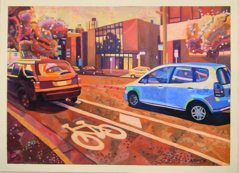
Bike lane in Urban landscape
Modernisation has caused a rapid shift in our local modes of travel. I guess these changes will endure as people shift to electric cars and more efficient public transport
I was particularly interested in pavement markings and graphic signage on this road as visual guidance for road users and as an aesthetic consideration.
The bold colour intends to attract attention to this familiar urban environment.
Each section has its use for horizontal and diagonal lines. However, there’s one figure in the distance that seems out of place within these road lanes.
The location: Bay Street, Port Melbourne.


